Friday, November 16, 2012

Table Makeover

I purchased this little beauty at our local Antique Dealer,  Antiques on 48.


Isn't she cute!  She's going to be Stunning! Can't you just hear Bruno from Dancing with the Stars ... Stunning!  Actually she has the Leg of a dancer, too bad she only has one.


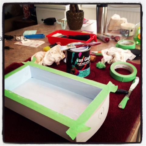
I broke out the van Gogh Chalk Paint in Chivalry, Chalk and Mama's Boy.


Here is the drawer painted with Chivalry and Mama's Boy on the inside for a little POP of colour.
I painted the drawer on our kitchen island while listening to Sophia Lauren and Cary Grant in the movie Houseboat, every once and a while I would watch a little of it.

 Here she is painted and the base and apron have been distressed, she's smooth as buttah!
Oh btw, every time I work on this table I think of Sophia Lauren so I'm calling her Sophia.
I designed a french graphic using my Silhouette Design software, then cut it in vinyl using my Silhouette Cameo.
Here is the top of the table prior to distressing with the graphic painted in Mascara and Chivalry.
I added a silver glaze (moon glaze) to the base and Apron to give it a luminous glow.
This glaze is part of the soon to be released van Gogh furniture make-up.
Here she is all finished, I'd like to introduce Miss Sophia!

I'd like to thank my studio assistant for being a good girl and not coming into the studio until Miss Sophia was complete.
Cookies for Miss Molly Brown!

sharing this at

Friday, October 12, 2012

Living Room design decisions ... input welcome

I want to spruce up the Living Room, I've wanted new slipcovers for some time and by the time I decided to go with blue Ikea had discontinued the blue I wanted.  Online search to the rescue and I found a lady who had 2 brand new slipcovers available ... yay!

This is what the every day living room looks like, nope I didn't tidy or dust!
Believe it or not the walls are butter cookie yellow but the current slipcovers don't help the wall colour.
This the a quick peek of the new blue slipcover, with one of my existing throw cushions.
The blue in the cushion matches the new slipcover but it doesn't light my fire, it's kinda blah.
I also have some dark denim throw cushions.

Then there's this exquisite piece of furniture (finger down throat)
I picked it up real cheap, with a matching end table.  It's been waiting for it's reinvention for 2 years now.  What?  I've been waiting on new slipcovers.  I was between the blue or white slipcovers.
Since we now have a new puppy that Frank invites on the sofa I just could not do white, I'd be washing the cushion covers ALL the time!
The PLAN for this table is a grain sack feel with either Red or Blue stripes.
The colour we choose for the throw cushion fabric will determine the stripe and graphic colour on the coffee table.
See my problem, one decision based on the last, if I hold up on one it puts everything on delay.
I've had a love affair with Toile for some time and have not used any decorating this home and I'm still not sure if I will use any traditional toile - you will help me decide ...
Here are my red choices, I was thinking I could do the front of the cushion in toile (left side) or the french stamp option (left side) and the back of the cushion with the ticking fabric (middle).
This gas fireplace is my reason for wanting to add a pop of red to the room.
The other direction I was considering is the yellow/blue toile to pick up the yellow walls.
the back of the cushion would be gingham, I'm leaning toward the blue.

What do you like?  Red Toile, Red French Stamp, Yellow&Blue Toile with yellow or blue gingham back?

Here is the link to the survey


Thursday, October 4, 2012

Quick 2 sided sign for mantle shelf


I had a scrap piece of wood that would be perfect for a small sign.  I measured it, then gave it a base coat of van Gogh Chalk paint in Buttah.


While the Buttah (I love that name!) was drying, I went into my Silhouette Studio and started designing what I wanted to put on this piece.  I have so many signs with words and sayings and honestly I could have them all over the house but I wanted a graphic option on this one.  I decided on a couple of birds sitting on a tree branch.  

Once the Buttah dried, I put the painted wood piece on the shelf and felt the yellow might be a little too bright for what I wanted so I put a coat of Muse over it.  Muse would pick up the warmer tones in the faux brick on this wall.  Meanwhile the conversation in my head was bouncing back and forth between a graphic image and a saying (I have SO many sayings I want to paint).  Then a light bulb went on!  Yep, I still have it!  Why not paint something on each side and I can turn it around a show the side I feel like seeing on any given day.  Cool huh?


So, I cut out the saying Believe in yourself and the Birds on a branch image, weeded them, applied the transfer tape and applied the first one to the painted wood.  Once on the wood I stenciled them with the Starry Night.


Then I let the paint dry slightly before peeling back the vinyl stencil

 Once completely dry I applied the van Gogh clear wax ... OMG this wax is heaven!  It smells like honey and had me craving toast with Buttah and Honey! 

I waited til the next morning and applied some dark wax, rubbed it in and called it a day!

Here are the finished signs up on the shelf


I haven't been to any party link ups in a while so I think it's about time, don't you.
I'll update my list as I link!

Hugs,

JoJo

Life is amazing

A year ago I was so disappointed when it didn't pan out for me to become a Mini stockist of Annie Sloan chalk paint. I approach things with a positive attitude and I knew that something better was going to come along. I had no idea it was going to be this good - Yep I'm so excited! Why you ask? The person behind all my excitement is a lady by the name of Kathy Van Gogh. Kathy is a decorative painter who has launched her own line of chalk paints manufactured right here in Canada. I am thrilled and honoured to become the Ontario distributor of Kathy's fabulous paints. I have started playing around with the paint on some of my own projects, I'll soon have a website launched for online sales but I'm also looking to assist Ontario retailers who would like to sell this paint and host workshops in their stores.

Following is the chart with available colours in van Gogh Chalk Paint, I will be working on some hand painted swatches that I will share once they are complete.


This week I cracked open the paint to do a couple of small projects.  I repainted my mantle shelf, painted my barn star and did a little 2 sided sign for the mantle shelf.  I love that this paint sticks to all surfaces without priming!

Here's my barn star in progress

First coat of Patina VGCP to star

Patina coat complete


 Here it is complete, with a coat of Starry Night over the Patina then I rubbed a damp cloth over the edges to expose the Patina coat, once completely dry I gave it a clear top coat.

I'm going to show you the sign I made in another post - stay tuned!

Hugs,

JoJo


Wednesday, September 12, 2012

Today's Guest Blogger - Miss Molly Brown

Hi!  My name is Molly Brown.
I'm 11 weeks old today and my human parents think I'm pretty smart.
I'm learning so much, like there is this big white thing with doors in the kitchen that my humans keep opening and food comes out of it!  How kewl is that!  This morning I tried to open it myself by biting it but that didn't work.  Sometimes when it's open I can run in and lick the bottles on the bottom shelf.  And and there's this big square thing in the middle of the room where my humans sit all the time. they put food and drinks on it, I think Mom called it a coffee table, well the other day I was able to put both of my front paws on it but Mom said "Off!".  That's just weird, if Dad can put his feet on it, why can't I?  There are a lot of rules around here but I'm doing really good learning them.


I have lots of fun stuff to chew on and attack, don't tell Mom but I'd rather chase Dad's feet and pull his shoelaces. Well, it's better then pulling his finger like some kids do with their Dad ... ewwww!

Well, I gotta go, I'm sleepy.

Sunday, August 12, 2012

2012 the Year of Change

2012 will be a year I remember forever!

I haven't posted lately and haven't worked on any projects for a while.  Come Fall I will have lots to share! I want to take the opportunity on this post to update the year so far.

The end of March we said good bye to our best friend and companion Buddy.  We've had Buddy since he was 3 years old, he was a rescue dog.  The term rescue dog is often misinterpreted, if you choose to adopt a dog from a shelter they will spend the rest of their days rescuing you
Buddy the miracle dog was diagnosed with Bladder Cancer in 2005 and we were told to take him home, make him comfortable since he only had about a month left with us.  I use to love burying my nose in the fur on his head when I hugged him, I know it sounds odd (especially to people who find dogs stinky) Bud had a perfume scent to his fur. No really, he did.  We can learn so much from our dogs, Buddy didn't know the vet said he had a month left to his life so he lived 7 years after being diagnosed.  He was good most of the time except for the occasion flare up of whatever was going on in his bladder.  If I had a dollar for every time Frank wanted to give Bud a special treat like ground beef with his dinner ... Frank would say "he's not well you know!"  haha! 


We miss you Budman, you will always be in our hearts!

Monday, June 18, 2012

Bed and Breakfast Sign Knock Off

I pinned this sign recently, I loved it and knew I had to make one!


This past weekend I was going on a Ladies Weekend to a friend's cottage and had been trying to decide what I would take as a hostess gift.  (insert light bulb turning on here) This sign would be perfect!!!
So I set out to start designing my version of this using Silhouette Studio.

This is a screen capture which shows how the type fits into the shape I was working with.  I had cut out half of the sign outline and traced it onto press board.  Frank used the Jigsaw and cut out the shape for me, he also sanded the edges for me.  When I cut the lettering out I left the sign outline so I would have a guideline for lining up on the wood.


In the meantime, I painted the board out in black, then gave it a coat of watered down elmers glue so the next layer would crackle.


I painted over the black with Annie Sloan Chalk Paint Old White, let it dry so it would crack.  When the paint was still a little damp I scraped some areas for heavy distressing, then sanded the whole sign and focusing on the edges.

One of the best things I have learned for script fonts especially is using good quality vinyl for my stencils and the right cut setting is key to fast weeding of the vinyl.  I also like using a dark vinyl so I can see the weeded letters better.
I forgot to take a picture while painting.  Here is the painted sign propped up outside so I can varnish.  Boy do I need a studio space!


Here is the final sign hanging in it's new home!

I'm linking to
 and


Saturday, June 9, 2012

It's Pallet Time!

When I saw that Funky Junk's SNS 138 was featuring Pallets and Reclaimed Wood projects I had to repost this project, it's one of my favs to date and I'm looking forward to doing more like it.  I think it was a post that Donna did a while back on how to select the right pallet for a project that started my obsession.  I'm very luck to have a good friend in the printing business and he now sets aside pallets that he thinks will work for my projects.

Here is the post on my pallet project ...


I have been obsessing over pallets and distressed wood lately.  Pinterest has just been adding fuel to the fire.  Initially I wanted to cover one complete wall in the living room with pallet boards, or Piet Hein Eek scrapwood wallpaper which is totally out of my budget!

I love this wallpaper!
Anyho, I recently asked my favourite Printer, Jim, what he does with all the Pallets that come into his building.  He told me he either returns them or trashes them ... WHAT????  They're treasure I told him, I must look at them.  So Frank came with me and the first beauty we set our eyes on was this one ...
I love her!  I must have her! 
She stayed in the back of my car for a few days, while I pondered what her future would be.
Then I received this image in an email from Joss & Main.
There's another image at their site with this clock resting against a skid/pallet and I loved the look.
I shared the image with Frank and told him I was going to make this clock and rest it against the pallet we brought home.  He said "why don't you just paint the clock right on the pallet".  Hmmmm.
OK!
Above is my "plan" for the project and our living room wall, can you visualize it?  Isn't it Cool?

So we got to work, Frank got to play with his Sawzall.
He removed the lower part of the skid for me.  While he was doing that I was prepping my masks to make the painting easier.
Here is the part 1, the background colours.

I used Annie Sloan Chalk paint as the base colours, the center is Old White and the outer section is mainly Louis Blue with some Paris Grey. I didn't go for complete coverage since I wanted the distressed look to come through.   Once the paint was down I slowly peeled back the mask.

Here she is, what do you think so far?  I do not know what I was thinking from here on as I do not have any photo's of the steps.  So next I painted the border, and numbers with black acrylic craft paint.  I used my Silhouette to cut my masks.  It was a little tricky, since I had to tile the image to get the size.
Once the painting was complete we drilled a hole in the center of the board for the clock motor to come through.  The hands are a little small but they were the best I could get without ordering online and waiting for them to arrive.  I'm on a roll and I'm not waiting baby!

This is her first reveal, we had a problem with the hands so I purchased a better set and movement from Lee Valley.   Next I painted the boards to mount the hangers and lanterns to.
Frank painted over a sign we had already to fit our colour scheme and we decided it looked so good we would put it over the clock on the sofa wall.
Today Frank put it all together on the wall, I am so happy with it.
Cool eh?

Here's an evening shot with the candles lit.

I really like the shadows these lanterns cast.
I wish I had a before photo but I hated the wall so much I didn't want any evidence.

This is the print that was on the wall, it looked lost on the wall and just did not suit our decor anymore (I'm not certain it ever really did).  I sold it on Kijiji to a nice couple who picked it up last week.  Yay!

I'll be linking to: